
fig5
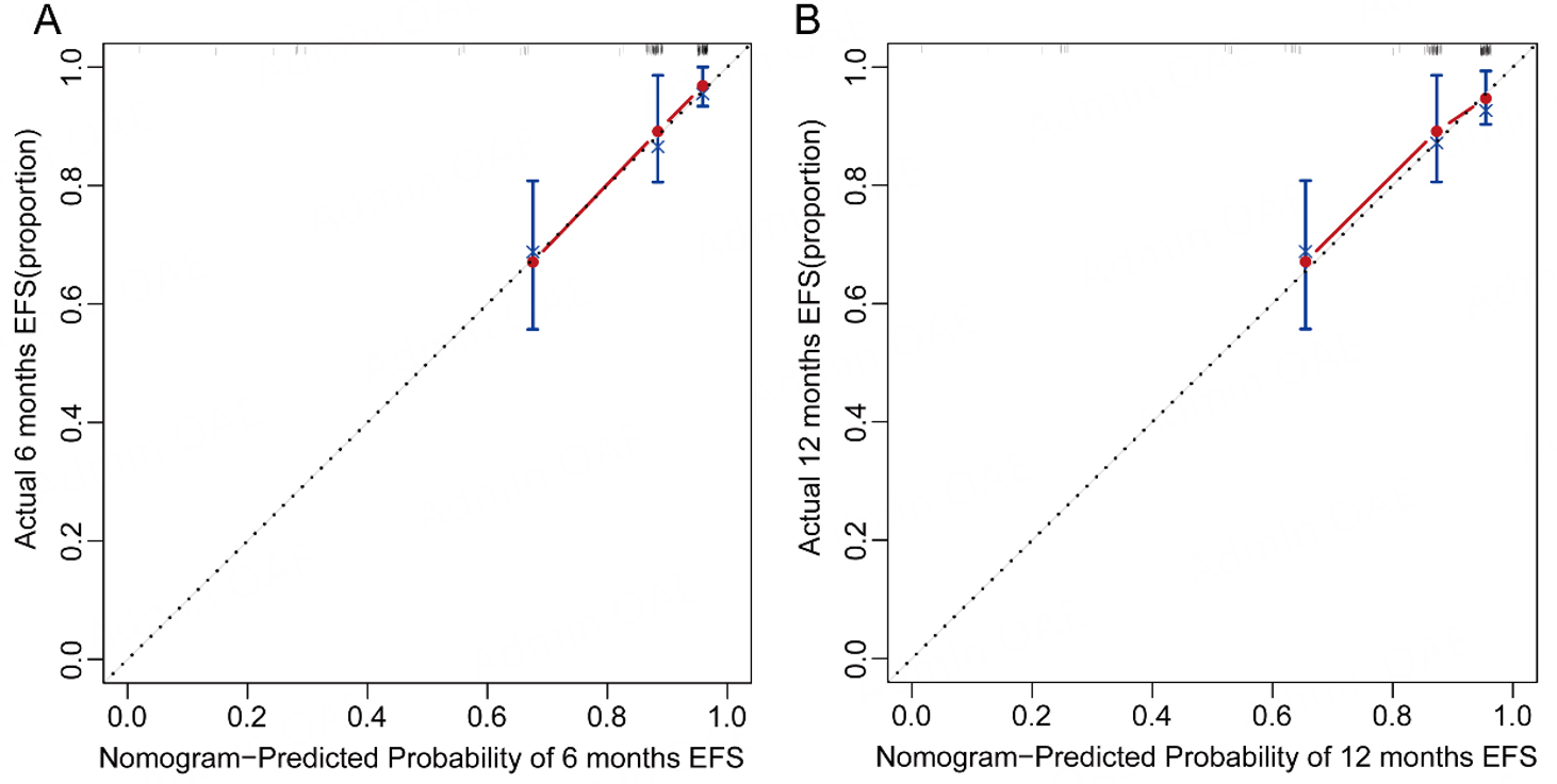
Figure 5. Calibration curves of the nomogram for predicting 6-month (A) and 12-month (B) EFS. Dots represent deciles of predicted risk. The diagonal line indicates ideal agreement between predicted and observed outcomes, and the solid line represents the bootstrap-corrected calibration curve based on 1,000 bootstrap resamples.